Photo Credit: Moss Creek
Have you ever sought out that perfect timber home design — one that has absolutely everything you are looking for — only to come up empty handed? Maybe you find a floor plan that you love, but the exterior just doesn’t excite you. Or, you find an exterior style that fits in with the area where you plan to build, but the floor plan doesn’t provide what you need or want. Searching for a single design that meets all your criteria, inside and out, can feel frustrating, but don’t let it derail you. Professional designers can mix and match floor plans and exterior styles with amazing results.
To prove our point, we are going to take a look at a very popular floor plan by MossCreek, a nationally recognized design firm, and see how many styles we can create with only small tweaks to the actual layout.
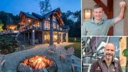
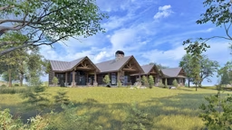
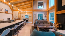
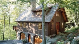
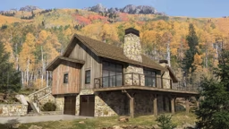
The original design is the 2,792- square-foot Decoy II, a plan that features a highly sought after main-level master bedroom, two upstairs bedrooms and three-and-half baths. The house has an open design that allows the kitchen, dining and great room to be visible to each other. The entry is positioned in the center of the house along a connecting gallery with a rear wall of windows. When visitors arrive through the front door, they are greeted by a framed view of the outdoor living porch and vista beyond.
The exterior is a classic, ruggedly refined exterior. A careful blend of materials, natural components and architectural details creates a quilt of textures and colors. It is a dramatic design perfectly suited for any rustic environment.
What if you love this floor plan layout, but you aren’t building in a woodland setting? What if your desired location is by the beach or in the suburbs; perhaps a contemporary neighborhood, the intercoastal Carolinas or in an area with a modern West Coast/Miami vibe? Let’s experiment and see if we can create exterior themes for each of these settings, with little to no alteration the floor plan.

Photo Credit: Moss Creek
The Decoy II Floor Plan
Intercoastal Carolina - Orchid IV

Photo Credit: Moss Creek
The intercoastal waterway and river front living in the coastal areas of North and South Carolina create an opportunity to blend traditional waterfront and inland architectural styles. This style is also interchangeable with up-country Caribbean-style homes. Characteristic themes are the blending of Colonial English influences with tropical considerations. Aspects of this approach include light colors, divided windows, provincial massing shapes and increased detail on the smaller elements.
The Orchid IV starts with the Decoy floor plan with altered exterior wall facades and roof shapes to create a simpler, more Colonial look. Other defining components are cedar shingles that cover the exterior for a classic coastal feel, windows and trim painted white, classic window shapes with true divides, exposed rafter tails, finials at gable peaks, an awning roof over the garage door and shingle roofing.

Photo Credit: Moss Creek
The Orchid IV Floor Plan
Neighborhood - Doppler

Photo Credit: Moss Creek
Contemporary design, which is a re-imagined 21st century version of mid-20th century architecture, has become quite popular. One challenge is that contemporary design doesn’t fit well in many traditional neighborhoods. However, new contemporary neighborhoods, as well as people with acreage outside of any neighborhood restrictions or covenants, are finding this style to be a fresh new take on creating a home with an expressive identity. Defining elements of contemporary homes are rectangular shapes with mono-pitched roofs. The array of boxes and rooflines need to have an “accidental” feel to their arrangement, while still creating a harmonically balanced composition.
The Doppler design starts with the exterior walls of the Decoy II plan and extends them upward to create simple rectangular masses. The tops were sliced at various heights, but at a constant angle to bring uniformity to the otherwise chaotic composition. The exterior materials are horizontal wood siding and vertical corrugated steel that create a combination of organic and industrial materials. The windows are single expanses of glass without divides. In terms of layout and flow, the plan is identical to the Dulcimer, but it couldn’t feel more different.

Photo Credit: Moss Creek
The Doppler Floor Plan
West Coast/Miami Modern - Duet II

Photo Credit: Moss Creek
Palms Springs, Los Angeles, Miami – these cities are hotbeds of modernist architecture by the likes of Richard Neutra, Paul Rudolph and their contemporaries. Their designs are instantly recognizable by their use of playful geometries assembled into expressive sculptural forms that boast swooping curves interrupted by stacked blocks and eccentrically placed elements.
The Duet II design is a study in what modernist design expert Dr. Guillermo Aranda-Mena termed “frozen poetry.” The origin of this design is once again rooted in the Decoy II floor plan. The walls were raised up to form left and right blocks. The left block has a roof that looks up to the sky, while the right has a barrel roof that looks straight forward. The two distinct forms are connected via a smaller-scale gallery. At the second level, our two major left and right forms create further resonance with opposing window arrangements. The left block has a single small window in the center of a field wood. The right has two unbalanced windows — one significantly under-scaled, the other seemingly appropriate.
At the main level, the exterior flows with more expected forms and expression. In the midst of all this architectural resonance; a symmetrical entry porch, and door and window arrangement, provide grounding for the composition of elements and denote a welcoming entry for the homeowner.

Photo Credit: Moss Creek
The Duet II Floor Plan
Suburbs - Dulcimer Modern Farmhouse

Photo Credit: Moss Creek
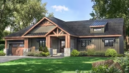
Some building sites are located in a relaxed suburban setting that isn’t quite rustic, but not quite McMansion territory either. In this setting, a modern farmhouse style can nestle in perfectly. Modern farmhouse architecture is denoted by a blend of contemporary and quintessential Texas homestead elements, including a black roof and black divided-light windows, to give a modern twist to these otherwise traditional aspects. The exterior is almost always board-and-batten siding (often painted white like you would see on a Texas farmhouse). Small window awnings that were used in farmhouses to protect doors and windows, are now extended to 3-foot overhangs with exceptionally long, angled braces to support them.
To create the Dulcimer Modern Farmhouse, the vertical shape of the structure was modified to be more angular and have more diverse vertical movement, boosting the contemporary feel. Then to keep it from feeling industrial, the classic modern farmhouse elements were applied.
This plan also stacks the second and third bedrooms to one side, rather than connecting them by the bridge, and the laundry/mudroom is situated perpendicular to the great room area, rather than vertically (as seen in the Decoy II), which allows the exterior to have that ranch/farmhouse flair. But the core of the home, with its central gallery, remains the same.

Photo Credit: Moss Creek
The Dulcimer Floor Plan
Beach Front - Orchid II

Photo Credit: Moss Creek
Beach front houses on the southern coast of the United States and in the Caribbean get abused by the weather. They are often built from concrete to defend against hurricanes, driving rain and intense sunlight. As a result, the style of architecture develops some common exterior themes such as stucco walls, metal roofs, mahogany wood garages doors and an overall “blocky” feel.
In the Orchid II design, we have taken the Decoy II floor plan and completely changed the exterior. This new exterior design features an attached garage, stucco walls, metal roof, a covered entry porch with an accessible deck above and a Colonial railing pattern to keep an east coast feel. Other elements include enormous glass panels on the rear elevation to bring the outdoors in and to connect the people inside with the people outside. The size of the Orchid II is slightly smaller than the Decoy, the fireplace has been eliminated and a few of the bump-outs are altered, but fundamentally, the layout is identical to its origin plan with a decidedly different vibe.

Photo Credit: Moss Creek

