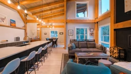
There’s a lot of math required in the home-building process. But there’s one simple equation that trumps them all: Square Footage = $$$. Of course you want to make sure you have plenty of space for your current and future needs, but you also have a budget to maintain, and over-designing can disrupt that delicate balance, tipping the scale out of your favor.
As you begin to design your dream timber home, you can save yourself a lot of headaches (and a few heartaches) by determining how you plan to use the home, then deciding the necessary dimensions to be allotted to each space based on its function.
To start, ask yourself a few questions, such as: Will this be a full-time residence or a vacation house? Are you a formal or an informal entertainer? Will this be a forever home for you or maybe a legacy home for your children one day? The answers will help determine how much space you really need and, just as important, how you allocate that space within the footprint.
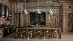
Take the question of your entertaining habits. If you have posh dinner parties, you’ll likely want a sizable formal dining room. If your entertaining rituals focus on friends gathering at your pad every Sunday to watch the big game, you may want to skip dedicated dining altogether, redistributing that space to the kitchen, where you can insert a huge island (or two) with open access to a family room.
TV-watching habits and sleeping arrangements also will affect your design choices. For instance, many people use lofts as media rooms or a children’s bunk room, but with a room that’s “open to below,” you should ensure that sound created in the loft won’t carry or that other rooms — especially bedrooms — are situated within the plan so that they are out of earshot of that sound.
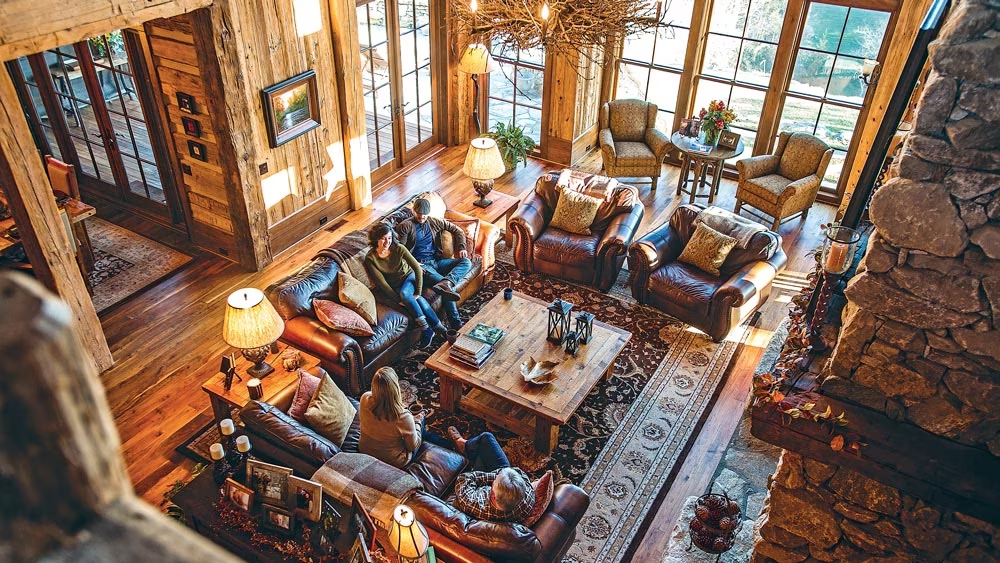
These transition areas can prove tricky at times, but your furniture can be used to help separate functional spaces by creating a visual divide. Often, it’s some form of sofa/sofa table arrangement to cordon off the great room from adjacent spaces; kitchen islands also can help in that respect. Just make sure you have at least a rough idea of how these items will fall in your plan before the construction phase begins so you can install floor outlets as necessary to minimize the need for extension cords.
Use Current Furniture as Your Guide
More often than not, you’ll be placing current furnishings within your new place rather than buying entirely new. The benefit is that you know the dimensions of these pieces beforehand, so you can work with your architect to ensure there is space for heirloom pieces allocated in the construction docs. They even may impact things like window height and door locations.
Be flexible with furniture arrangements, too; not every piece of furniture needs to serve the exact same purpose as it has been in your current residence. In fact, a novel purpose can make a timeworn piece feel brand new. For example, a dining room buffet from your current house may function better as a sofa table in your new home, or a beloved oversized chair that used to have pride of place in your living area may find a new home in front of a bedroom window.
Visualizing the New Arrangement
Staring down at a ¼-inch scale drawing may not be helpful if you don’t have a frame of reference for comparison. If you’re weighing dimensions for key spaces, ask your builder to take you to homes he or she has constructed to help you see how large or small that much space feels.
You also can put pencil to paper by incorporating ¼-inch drawings of your own into the plan, so that you can better understand traffic flow and livability. Shade out the logical pathways (which should be 36 to 42 inches wide for comfortable maneuverability) between areas such as the kitchen and great room, so you can see the natural flow of the spaces. Area rugs help define functionality while allowing the flooring to show through in these major walkways.
Lighting is critical as well. If you plan to incorporate high ceilings, as many timber frame homes do, use a mix of decorative, up and down lighting. Steer clear of delicate fixtures, which can be quickly dwarfed by vaulted ceilings and the visual impact of the timber frame structure, itself.
Great Rooms
- Base measurements should start around 15-by-15 feet for a comfortable gathering area.
- An area rug should fit under at least two-thirds of a sofa to visually connect it to the room.
- Wall-adjacent sofas should take up no more than two-thirds of the wall space against which they are placed.
- Conversation areas should be approximately 10 feet across, with 15 to 24 inches in between each furniture piece to ensure a cozy arrangement.
- Leave at least 36 inches of clearance in front of the hearth as a safety precaution.
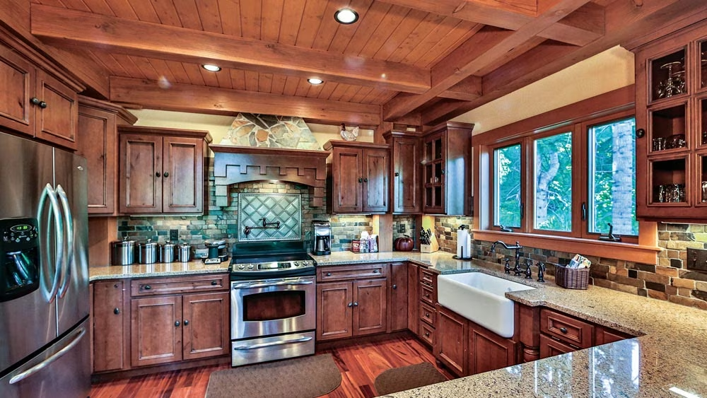
Kitchens
- At least 18 square feet of general storage is recommended, with 6 square feet added to that total for each additional family member.
- Incorporate at least 12 inches of work surface on one side of your refrigerator or stovetop for adequate prep space.
- The legs of an efficient triangle (the space between the refrigerator, sink and range) should total no more than 26 feet, with no leg equaling less than 4 feet.
- Countertops should be at least 24 inches deep.
- To make appliances universally usable, leave a 30-by-48-inch clearance space in front of each of them.
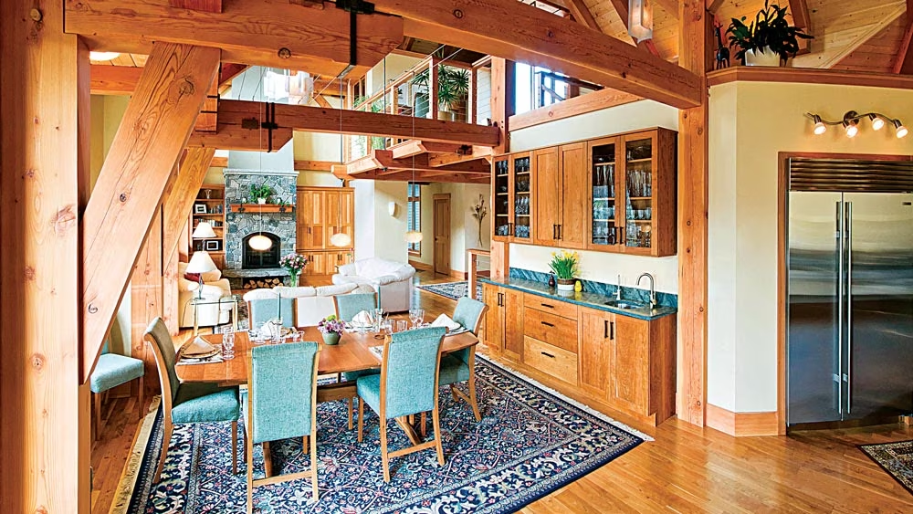
Dining Rooms
- A dining table should be no more than 48 inches wide to make everything on its surface is easy to access, with 24 inches per person factored into its perimeter.
- A clearance of 36 to 44 inches around the table is required for easy flow of traffic.
- Display pieces (e.g., curios, buffets, etc.) should be placed at least 24 inches apart.
- Any rug placed underneath the dining table should extend at least 2 feet past the edge of the tabletop.
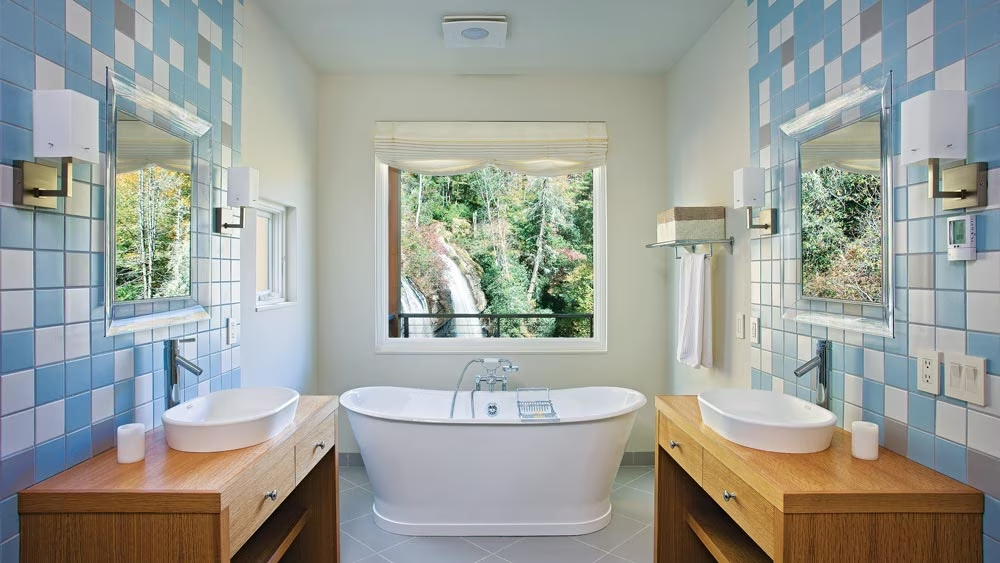
Bathrooms
- Recommended minimum dimensions for a powder room are 3-by-6 feet; for a full bath, 5-by-9 feet should provide enough space for a tub and basic fixtures.
- Stack bathrooms on top of or close to one another to centralize plumbing runs.
- Leave a minimum of 30 inches of space between fixtures and/or walls; extend that clearance to 5-by-5 feet to achieve a more universal design.
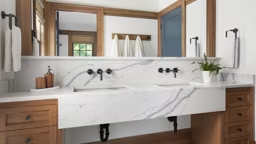
- Dual sinks should be placed at least 36 inches apart.
- To achieve a more universal bathroom design, extend the clearance between fixtures and/or walls to 5-by-5 feet.
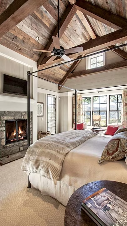
Bedrooms
- The recommended area for guest or secondary bedrooms is 10-by-12 feet, but you may wish for more in a primary bedroom depending on what amenities you plan to include. Anything smaller than 9-by-11 feet will likely feel cramped.
- Include 4 feet of clearance in front of closets to provide plenty of room to get dressed.
- Linear wall closets should be no deeper than 24 inches.
- Mark beds to scale with your plan to determine if there will be enough walkway space (30 inches minimum between furniture pieces) around your bed. (See standard mattress sizes below.)
Miscellaneous
- Hallways should be between 3 and 6 feet wide.
- Comfortable coat removal requires between 3 and 5 feet of space. Note the number of guests you may have entering at any point in time, and plan your foyer and/or mudroom accordingly.
- Stairways should be 39 to 48 inches wide.
- Stair treads should be 10 to 11 inches deep with a maximum 7-inch rise to make them easy to climb. There should be no more than 4 inches between treads in an open staircase.


