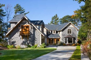
To demonstrate how you can successfully customize a stock plan to suit your needs, we took a home featured in our October 2013 issue and worked with the folks at Riverbend Timber Framing to show what five different homeowners did to customize the popular plan to their liking. Some flipped the plan end-for-end, others added a bigger wing, still others toned down the look or merely extended the space between the garage and the core of the house to accommodate a mudroom. Almost all moved rooms to take advantage of the views their particular properties offered.
The starting point was Riverbend's Tuscany plan, which has been built in several different iterations. Outside it has an Old-World look with dormers on a steep roof and an open plan inside that is easily flipped to move rooms for a better view. Its soaring trusses and partial cathedral ceiling permit partition walls to be added or subtracted.
The Original Tuscany Plan
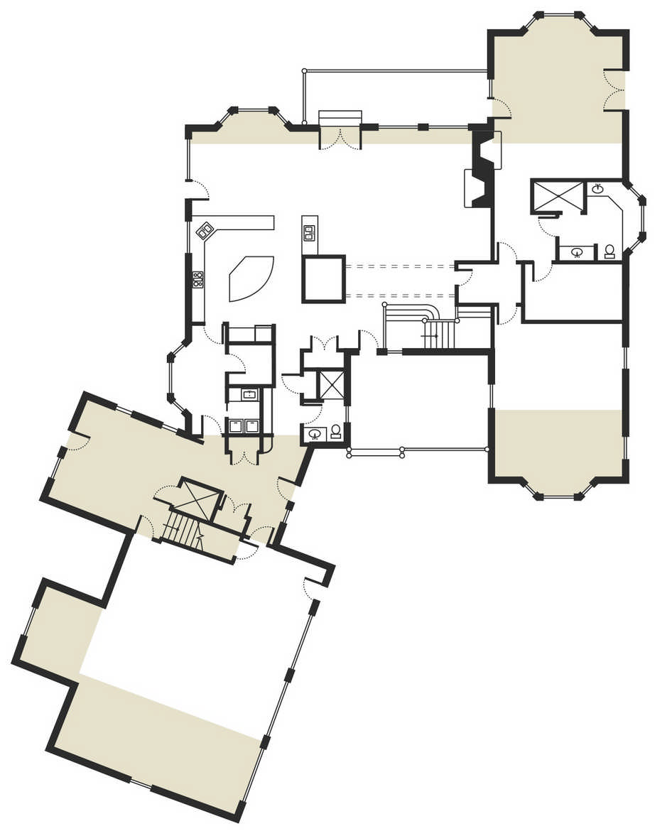
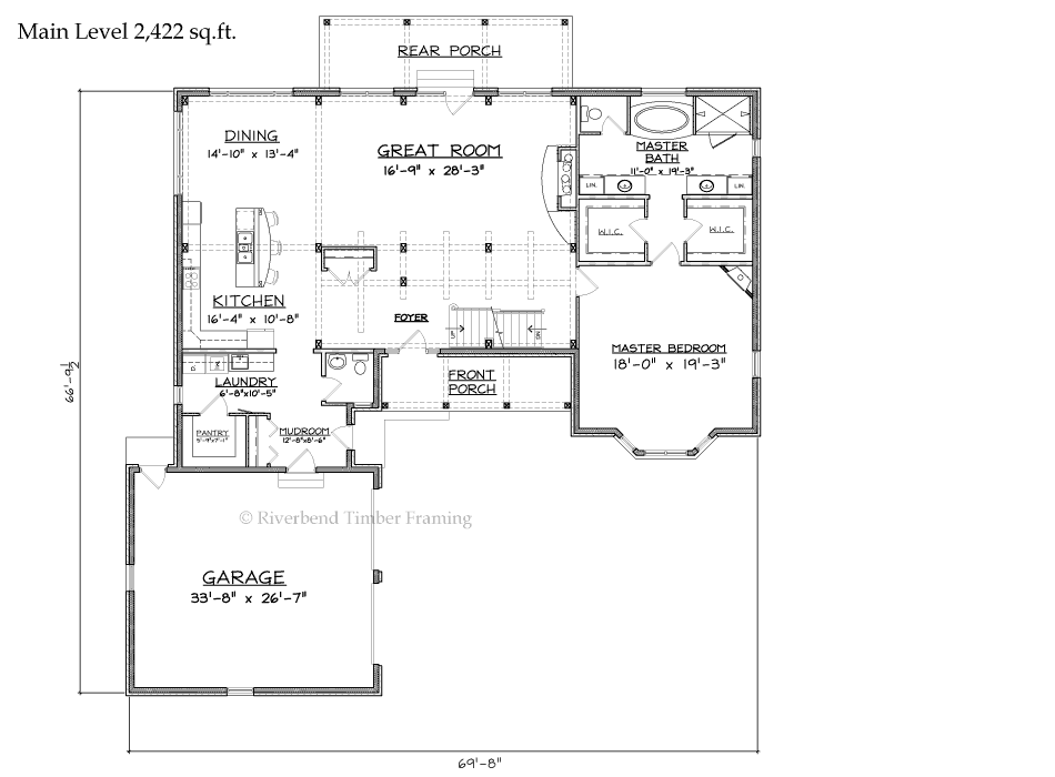 Tuscany in its original incarnation is a relatively simple home with a garage leg in front giving the home an L-footprint with a circular turnaround driveway. A slightly recessed front porch leads into the central core of the house through a cozy foyer with stairs to a second-story walkway bridge overhead and a view through the great room straight out the backside. The core is bookended by two sections: one public, one private.
 Behind the garage is the public section, with a dining room off the entry and a kitchen in back. The opposite side of the core contains the master suite characterized by a bedroom bay window in front and dual walk-in closets leading to a large master bath in back. The circular, turnaround driveway gives the entrance the feel of a stately mansion. The front lends an air of depth, with the recessed porch, the large garage extending out, the bay window on the master suite, and the steep dominant roof with four or five gables.
The Burnside Home
 Bob Burnside stuck pretty close to the original Tuscany floor plan, but built it with native red and white oak timbers and decorated it in a French Country style. He did change the plan and the home's look in one important way: To accommodate business visitors, he doubled the size of the garage by adding a third stall, a storage room and a stairway to an over-the-garage office. Between the garage and the house, Burnside added a pantry space downstairs and a sitting room/library upstairs. He also added a furnished lower level that increased the square footage to 7,000.
 To help keep utility bills for such a large home in check, he built a green home that qualified for a national Energy Star five-plus rating and won a 2006 Energy-Value Housing Award from the National Association of Home Builders. With structural insulated panels and a geothermal heating-and-cooling system, an entire year of heating, air conditioning and hot water for the large Michigan home is only $750.
The Koblis Residence
 Judy Koblis is a fan of "Lord of the Rings," so when an Internet search turned up photographs of the cottage-like, Old-World Tuscany home, she told husband Marty, "This is perfect." Nonetheless, they settled on a few changes. They added 16 feet to the one end of the house, increasing the size of the kitchen and adding a laundry room and full bath. The old laundry area just inside the garage became a huge butler’s pantry. "Judy wanted a bigger kitchen and bar," Marty says, "because that tends to be where people gather." They also added a wall to keep the dining room totally private from the kitchen and great room to make it "a little more intimate."
 To give the room some air and light, they installed French doors that open to a patio and a view of the green forest of the nearby Sierra Nevada foothills. Depth of the now three-stall garage was redrawn to 28 feet, from 22 feet, Marty says, "because I wanted some working room." Garage doors were rescaled from 7 feet high and 8 feet wide to 8 feet high and 9 feet wide to make them more proportional to the look and size of the outside of the house. Inside the copper-topped dormers, the upper-level walkway is the one feature that the Koblises (like all of the other Tuscany owners) kept. "We love it," Marty says. "You can stand there and look at the beautiful timbers inside, into the surrounding woods or down into the turnaround."
The Wolfe Residence
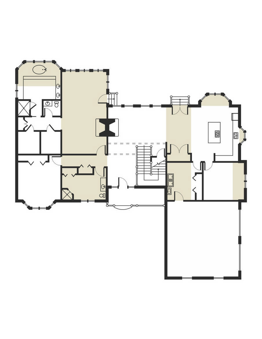 When Diane and Warren Wolfe decided to build a new home, they spent months evaluating stock plans from timber companies until Tuscany, with its cottage look, an open walkway on the upper level and the dramatic trusses caught Diane's eye. But she had a big binder comprising ideas of her own, so she gave the company representative her re-drawn version of the floor plan. "She knew exactly what she was looking for, and that helps a great deal," Rotroff says.
 Her drawing, which flipped the entire plan to put the garage on the right, included a more spacious kitchen and master suite, an office and a studio. The final plan drawn by Rotroff and Riverbend Design Director Marty Birkenkamp combined the original plan, Diane's sketch and local deed restrictions into a workable blueprint that eliminated the entry turnaround and moved the garage doors to the outside. The Wolfe's preferred an open floor plan, so they eliminated the wall between the kitchen and dining room. The addition of an office in the larger master suite wing, now doubled in size, provided room to enlarge the entry powder room into a full bath.
Behind the garage, a slightly larger kitchen-dining wing allowed the two rooms to be placed side by side at the back of the house with a studio and laundry room just inside the garage. To keep the outside in smaller scale, the two-story original was lowered to a story and a half. On the inside, it gave a walk on the upper-level bridge the feel of being inside a jewel as you walk through the open trusses.
The Delevan Home
 James Delevan loved the Tuscany plan, but had two huge circumstances to consider, one good and one not. The not-so-good concern was that very close to the north (master suite) side of the house a ravine cut dangerously close to the circular driveway.
 The other consideration was that the house would sit on a protruding cliff 90 feet above Lake Michigan, which meant gorgeous views. "Lake Michigan is the show," he says. And with those potential views, it took little thought to move the master bedroom and the dining room — in the front on the original Tuscany plan — to the back of the house alongside the living room. A private screened-in porch off the bedroom and a huge deck off the living and dining rooms took further advantage of the view. But the ravine was still a problem, so the architect suggested rotating the garage at an angle away from its usual position — to move the driveway away from the ravine. "It was really the only thing he could do," James says.
With the master bedroom moved to the back, or "view side," of the house and extended out toward the lake a bit, the Delevans decided to use the space in front for a media room that is large enough to handle an audience of 20 people. With the media room extending farther in front than the original plan, a similar extension on the other side provides for a farmer's entry, or mudroom, that includes a laundry room, a large pantry and a full bathroom. The two side extensions resulted in a deeper-than-normal covered front porch. The Delevans also enlarged both ends of the garage, with a third stall and with an elevator between the garage and laundry to access the fourth-level tower high above. The centerpiece of the home’s core is a spiral staircase, which opened up the foyer and permitted a clear view from the front door out through the great room windows.

