Home by PrecisionCraft Log & Timber Homes

Originally designed in 2009, the Suncadia was a timber home ahead of its time, helping lead the charge for the “mountain modern” design aesthetic that has grown in popularity over the past decade.
It was the brainchild of two longtime friends who had a vision to build a timber-framed retreat like no other. They brought their ideas to M.T.N Architects, the design firm behind PrecisionCraft Log & Timber Homes, and lead architect, Matt Franklin. Since then, the Suncadia has been the springboard for a number of variations to the design.
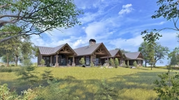
“People really like that the Suncadia is different than most log or timber homes out there, especially when it comes to single-level houses. It’s not your typical ‘ranch,’” says Matt. “The openness and the amount of glazing (i.e., windows) on the view side of the home have big appeal.”
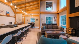
One unique aspect of the design is what Matt calls the “verticality of the space” — a concept particularly evident in the 18- to 20-foot-tall ceilings in the primary bedrooms. “The rooms are so tall, especially compared to how deep they are. It’s atypical of what you’re used to feeling,” he says. “It almost feels like the walls behind the beds are propelling you into the outdoor space. You cannot ignore the views when you’re in those rooms.”
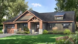
But the ingenuity doesn’t stop at bedrooms. The plan offers a number of dramatic features that begin before you even enter the house. “The covered entry is low and super compressed, and then, when you transition into the home, it expands away from you and really pulls your eye out toward the sky,” Matt says of the Frank Lloyd Wright principle that guided the design. “It’s an experience.”
The Low Down
“In terms of its DNA, the Suncadia is not too far off from its inspiration plan, the ‘Cascade,’” architect Matt Franklin shares. “It’s a quite a bit larger (by about 2,000 square feet), but it’s also a little cleaner. The Cascade is angular and abstract, whereas this plan is more linear.”
The design may be more straightforward than its forerunner, but it’s no less resourceful. In fact, it’s this approach that is at the heart of its success and its popularity.
“Because of its size and the fact that it’s one level, this plan really forces your hand as a designer to compress it and let it flow horizontally, but it also reinforces the contemporary aspect of the design,” Matt says.
What would Matt change about the house he designed over a decade ago? “If budget weren’t an issue, I would ensure that every bedroom has its own en suite bathroom and walk-in closet,” he admits. “Back then, a shared Jack-and-Jill bathroom was adequate. Now there’s a definite push for every bedroom to have a private bath, as well as increased closet space. However, this would entail enlarging the home’s footprint slightly. ”
The Inside Scoop
Constraints Create Opportunity.
This home was designed for a planned development, and while the lot set the stage for an easy build, there were some restrictions on the height of the structure and the pitch of the roofline. These factors led Matt to look to a more horizontal approach.
Two is Better Than One.
The original intention was that this would be a house that several families would use at once, which led to the dual master suite layout — a rarity in 2009 when it was conceived. Now a double-master design is frequently specified.
Support Network.
The house was engineered to withstand heavy snow loads, but the great room still sports a 20-foot-wide vanishing wall, allowing for true indoor/outdoor living. An exposed steel beam works with the timbers to reinforce the opening.
Plan Details


- Thanks to the open, undefined foyer, you come face to face with the view through the great room’s massive window wall the moment you open the front door.
- The mechanicals were shrewdly located near the bathrooms, making heat and hot water runs very short. To minimize noise, buffers in the form of a walk-in closet and a built-in bookshelf were incorporated into the bedrooms.
- The great room features a vanishing wall, guaranteeing the ability to blend indoor/outdoor living.
- The house was designed for a ski-area, so to keep wet, muddy clothes confined, the laundry was located close to the garage instead of the bedrooms.
Home Details
Square Footage: 4,700
Bedrooms: 4
Bathrooms: 3 full, 1 half

