Photos and Plan: Modern Rustic Homes

Intentionally designed to provide single-level living for soon-to-be retirees, the “Dragonfly” by Georgia-headquartered Modern Rustic Homes, hits the sweet spot for home buyers of any age. The original couple behind the plan wanted to ensure the house would accommodate their daily needs, as well as their desire to host friends and family for extended visits. But, the four bedroom, three-and-a-half bath layout is as conducive to young families as it is to those aging in place.
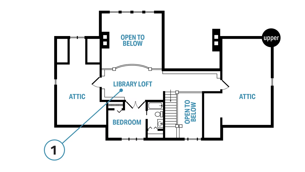
Although all the necessary living areas are contained on the main floor, the house is a two-story plan. In addition to one of the home’s four bedrooms, the second level boasts an intriguing library/loft that also could serve as a playroom or office as needed. Two huge attics can support extra finished living space, or they can simply provide an abundance of storage. It’s this kind of versatility that has made the Dragonfly one of Modern Rustic Homes’ most popular plans.
“The Dragonfly has adapted well to locations in Montana, Pennsylvania, Georgia and Tennessee,” shares Modern Rustic Homes’ founder Michael Grant. “The plan has a human scale that is comfortable, cozy and very desirable.”
The Low Down
The inspiration for the Dragonfly started with Michael Grant’s clients’ wish list for their retirement years but was quickly influenced by its waterside location.
The empty nesters wanted a floor plan that accommodated family and friends but also allowed for one-level living. This was an easy (and common) request for the Modern Rustic Homes team to fulfill; however the unique contours of the couple’s site, combined with their desire to capture expansive views of the surrounding mountains and the property’s robust trout stream, played a huge role in both the final design and the materials used to build it.
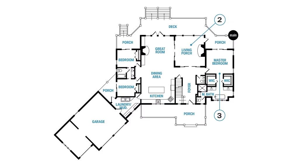
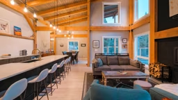
The living porch, great room, dining and kitchen combine to become one wide-open area. When open, the 12-foot-wide sliding doors adjacent to the porch double the usable space, creating the ideal spot for entertaining.
“By design, the kitchen, dining and great room share one space,” Michael explains. “Attention was paid to ceiling finishes as well, using drywall on the flat ceilings with heavy timber beams and rough sawn planks for the vaulted ceiling. This linear design reduces excess square footage by eliminating hallways and affords natural light from both sides.”
The communal spaces also separate the master suite and first-floor guest bedrooms, enhancing privacy. The garage was angled to accommodate both the property’s setbacks and easy access for cars. The connector between the house and garage contains the laundry, pantry and utilities, making excellent use of an otherwise oddly shaped room.
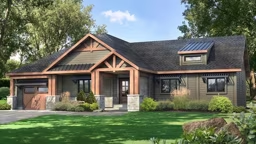
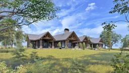
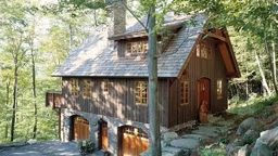
“The end result was a blend of synthetic and natural materials that created a rustic Craftsman style,” Michael shares.
The Inside Scoop
Though houses are comprised of the same basic elements, when it comes to successful design, how those elements are arranged make all the difference. Consider these savvy tips as you consider your own home’s layout.
Smart Use of Space.
The spare bedrooms were designed to be small but comfortable. The Jack-and-Jill bathroom accommodates guests nicely while remaining an economical decision.
Offset to Set it Off.
In many plans, the foyer has a direct line of sight into the living area, but in this plan, the entry is offset from the great room, leading the eye toward the screened-in porch instead. This design decision affords enhanced and uninterrupted views, making nature the focal point.
Firepower.
Like a mirror image, the indoor and outdoor fireplaces are located 38 feet across from each other and frame the living spaces.
Home Details
1. The library loft sports its own coffee bar in addition to optimum views. Once the owners moved in, the generous attic space on the left side of the plan was quickly converted to a home office, while the second attic space provides ample seasonal storage.
Square Footage: 2,744
Bedrooms: 4
Baths: 3 full, 1 half

