
1. Neglecting the porches.
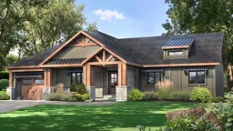
Seattle, Washington, architect Edward Carr says, “A shed-roofed porch that’s accessible through French doors and is about 7 feet deep with a flat ceiling (flat ceilings reflect light better than sloping) ushers good light into the house. Plus, a deeper porch provides plenty of space for a table and seating.”
2. Overlooking the garage entry.
According to syndicated homedesign columnist Katherine Salant, “The formal entry shouldn’t be the only place to hang coats, backpacks and other items. Since many of us enter through the garage, plan an entry space there for those items so that the home’s inner sanctum remains clutter free.”
See also Design Ideas for Built-Ins
3. Insufficient headroom at the top of a staircase.
Architect Dennis Lippert says this often can be a big oversight. “Plan at least 6 feet 8 inches of headroom along the steps and landings, and at least 3 feet for width, with extra room allowed for railings,” he advises. Bonus: Open stairs make it easier to move furniture.
4. Pack-rat fever.
The biggest problem Ralph Kylloe sees isn’t a design problem at all. It’s an accumulation problem. “People are insatiable collectors,” Ralph says. Everything you own doesn’t have to be on display. Solution? Allow for large closets and plenty of storage space in the basement.

